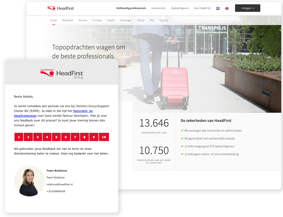
Reports & Dashboards
Comparison
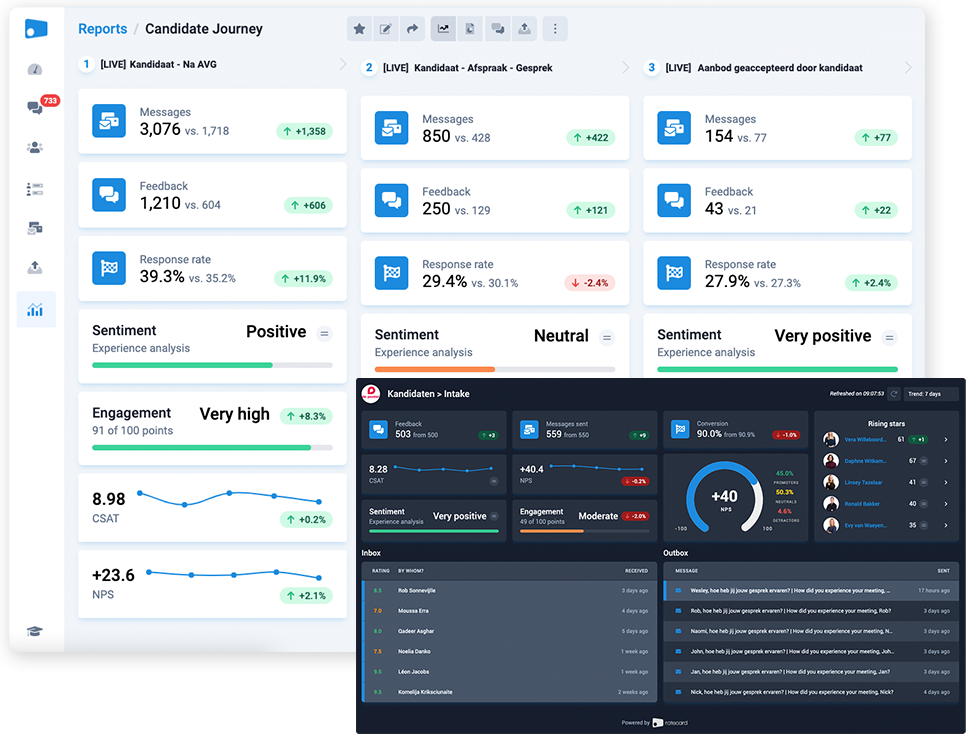
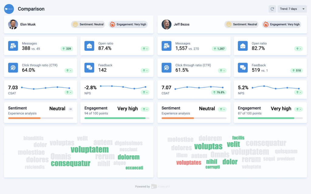
Compare two entities - e.g. users, teams, offices, or touchpoints - with our prebuilt Comparison report. This way, you can compare engagement, sentiment, quality, and much more.
Get valuable insights via this real-time report
Aggregate, map and analyze your feedback collected on autopilot with our prebuilt comparison. Isn't this report what you were looking for? Check out our report templates with many more options, or build your own report within minutes. We hope you like it!
Comparison
The comparison report lets you compare two entities. For example, you can compare two users, teams, offices, or touchpoints and gain insights.
Audiences
It can be extremely valuable to compare the engagement and sentiment of two audiences (named "groups" within our app).
Touchpoints
Get an in-depth comparison of two touchpoints within your journey (named "campaigns" within our app). If you want to compare more touchpoints within one view, you can use our leaderboard report.
Users, teams & offices
Get insights into how two users, teams, or offices compare to each other based on the number of messages sent, open ratio, click through ratio (CTR) and feedback collected.
Select, filter and visualise your data
We let you decide what data to use within your NPS dashboard: 100% flexibility in what data you'll use, how to filter, and how to visualise it.
Enhanced filters for feedback & messages
You'll decide what dataset(s) to use and automatically update for each report. Enhanced filters make sure the correct data is shown all the time.
Building blocks & views for visualisation
Want to show, hide, or change a chart, stat, or list? No problem, it's all configurable in a few clicks. Also, we support different views for (a list of) feedback, messages, analysis, and the dashboard itself.
Themes: Dark & light
To make sure our reports and dashboards fit the look-and-feel of other apps and tools you work with, you can set the theme to dark or light.
Export, share and embed your data
No need to feel locked in, because we make sure your data is portable. You can export it any way you want, share it with anyone, and even embed it within your favorite apps & tools.
Use any report as your dashboard or embed it
After you've set up your ideal report, you can set it as your dashboard within Ratecard. Also, any report can be embedded as an iFrame.
Export to CSV, PDF & third parties
If you like to work with the data yourself, you can always export it as a CSV. Moreover, it's very easy to use our data within your favorite BI tool like Power BI, Google Data Studio, Tableau, or Qlik.
Share with your stakeholders
You can share any report both in-app, with other users, and publicly - via a shareable link. If necessary, you can add protection - e.g. via a password.
Looking for another report template?
Check out more prebuilt report templates
Didn't find what you're looking for yet? Check out our prebuilt report templates below. When you've found your report, you'll be up and running within the hour.
Analysis
- Analysis
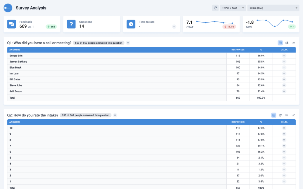
Need an in-depth analysis of your feedback? No worries. We automatically generate your survey analysis so you can analyze your aggregated and individual responses per question answered.

Company Dashboard
- Company Dashboard
How do you perform? And who's acing it within your company? Present the outcome of your experience programs in real-time with our prebuilt Company Dashboard.
Company Profile
- Company Profile
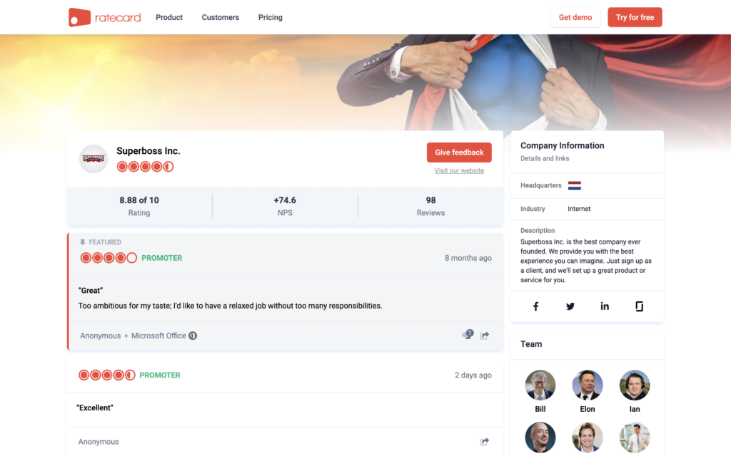
How do people review your company? Present your company and manage your reputation with our prebuilt Company Profile, built to help you grow your business.
Comparison
- Comparison
Compare two entities - e.g. users, teams, offices, or touchpoints - with our prebuilt Comparison report. This way, you can compare engagement, sentiment, quality, and much more.
Customer Satisfaction (CSAT)
- Customer Satisfaction (CSAT)
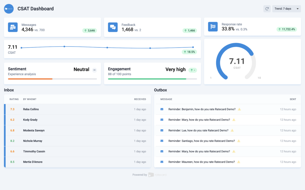
How do your candidates and/or customers rate your company? Present the outcome of your Candidate or Customer Satisfaction (CSAT) research in real-time with our prebuilt CSAT Dashboard.
Journey
- Journey
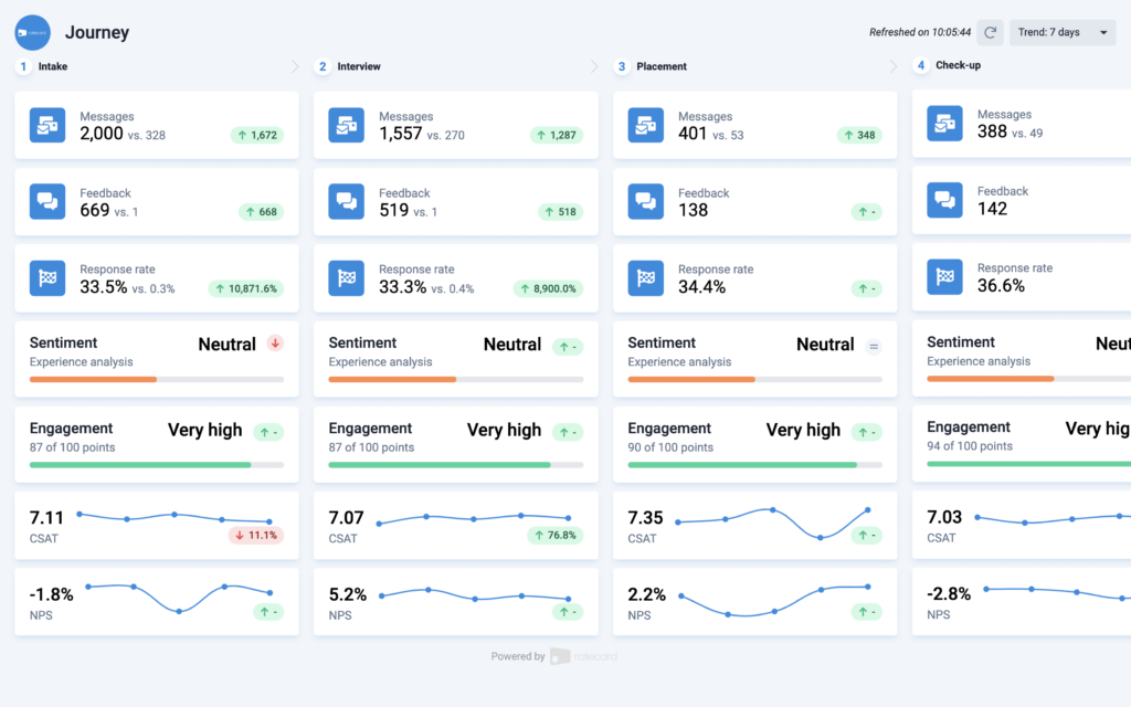
This prebuilt report helps you to visualize, measure and improve your candidate, customer, or employee journey and its touchpoints so you can compare engagement, sentiment, quality, and much more.
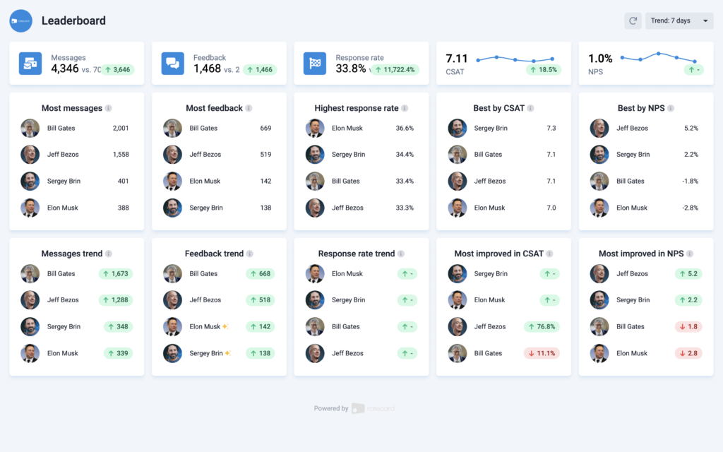
Leaderboard
- Leaderboard
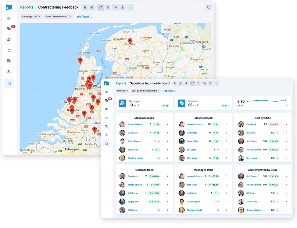
Set up leaderboards of contacts, users, smart fields, or teams, so you can compare their CSAT, NPS, conversion, and more. This leaderboard shows lists with users.
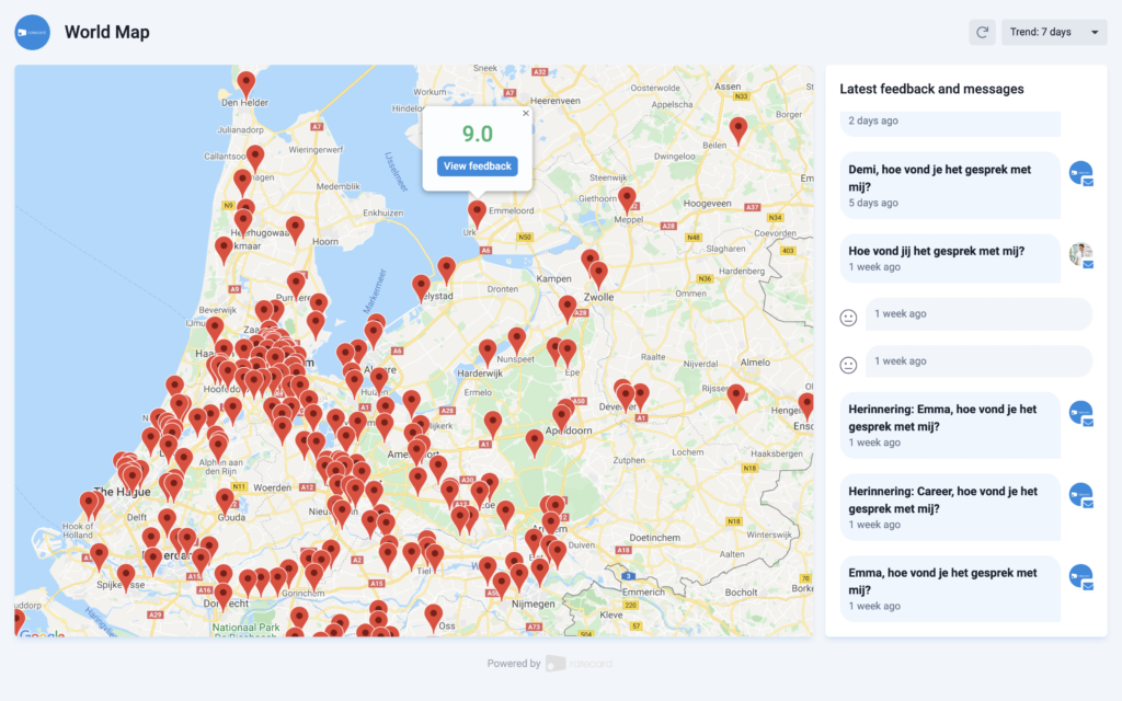
Map
- Map
Create a map with markers or a heatmap of feedback you’ve collected. We use IP addresses to set up this map. Let's rule the world by improving every day.
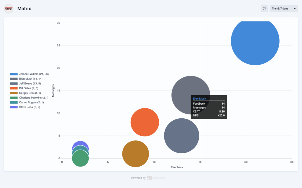
Matrix
- Matrix
This prebuilt report lets you set up a matrix to compare users or teams based on CSAT, NPS, and/or the number of feedback collected and messages sent.
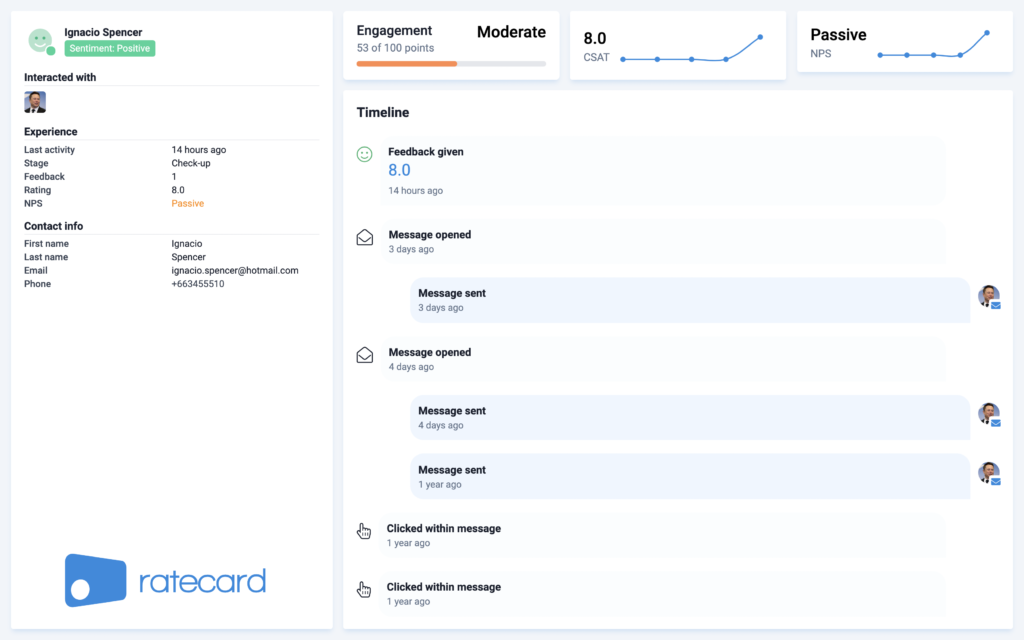
Micro-analysis per contact
- Micro-analysis per contact
Get a unified overview of your contact's engagement, sentiment, and timeline of interaction: messages sent, opens, clicks, and feedback collected - combined in one view.
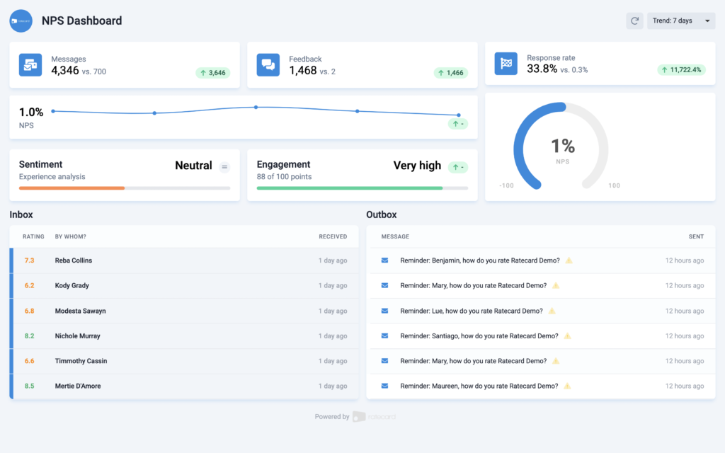
Net Promoter Score (NPS)
- Net Promoter Score (NPS)
Would your customers recommend your company to their friends and colleagues? Present the outcome of your Net Promoter Score (NPS) research in real-time with our prebuilt NPS Dashboard.
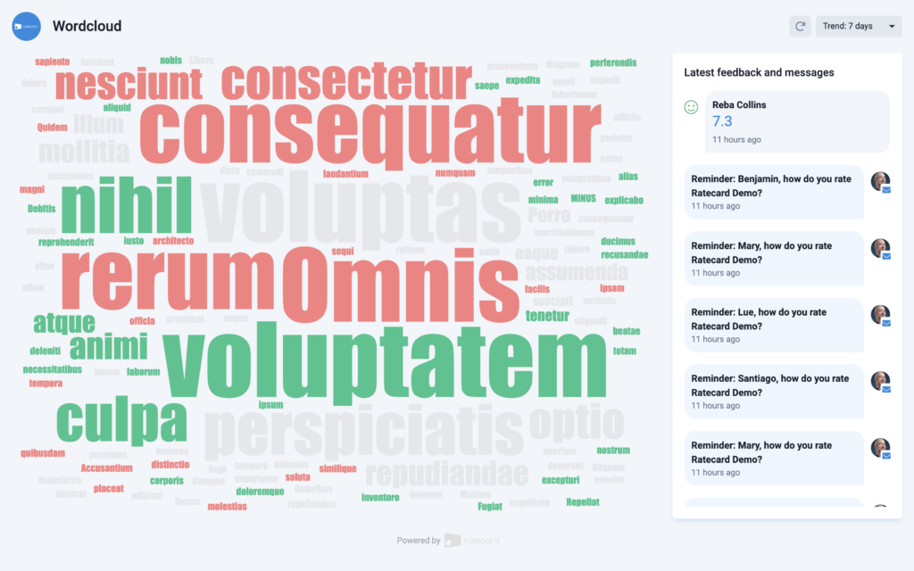
Word Cloud
- Word Cloud
This prebuilt report helps you to visualize everything your respondents said about you combined with sentiment in a word cloud you can customize.
Improve your experience on autopilot via our 1,000+ integrations
Take your company to the next level with the world's most powerful feedback solution. Fully on autopilot via all your apps & tools.
Our reviews
What do our users say about this?
We use our own solution to collect real-time customer feedback, of course. Hereunder you'll find what our customers have to say about us:

